Almost All About
Almost All About Subsequence
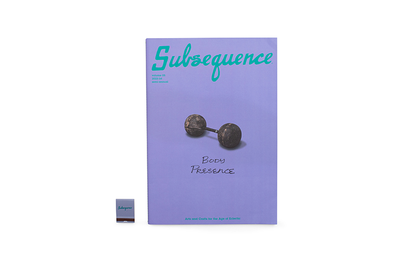
vol.2: The Magazine Format
2022.10.21
Almost All About
vol.3 Printing and Ink
2024.09.03
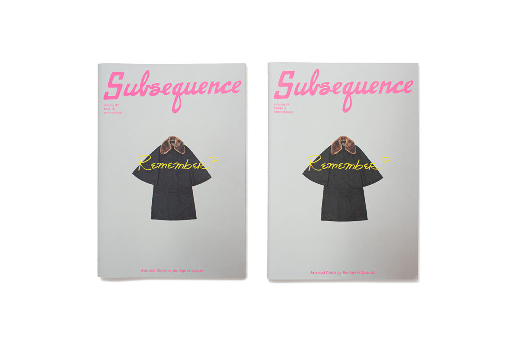
Both of the magazines in the images are test pressings called “color proofs.” This is a pressing of the product created to check the printed color quality. This isn’t just limited to the cover; every page of the magazine is printed out to see how the final product will look.
So why do we have two test pressings? Well, the one on the left uses oil-based ink, which we have been using since the first issue of Subsequence, and the one on the right uses UV ink. It is rather difficult to see what the difference is in photos.
In checking the color proofs, the editing team’s requests are among the following: “Remove the murkiness here,” “Increase the darkness here,” “Increase the saturation here,” “Increase the contrast here,” “Increase the clarity of this focal point.” In particular, due the matte paper that we use for Subsequence, it is easy for the colors to end up looking a little less vibrant. We need to closely check and adjust each photograph and image in the magazine to make sure their essence is sufficiently brought across.
For this issue, our printers suggested we try UV ink. UV ink dries quickly without a tendency to smudge and has a characteristic sheen due to the fact it doesn’t seep deep into the paper.
We handed the UV ink proof to our four members of the editing team. Their first reaction was, “Wow, it’s so pretty!”, but as they flicked through the pages, they realized that something was slightly off. While it was true that the images were vibrant and clear, it lacked the soft, mellow tone that Subsequence has. Not only this, it also seemed to smooth over and destroy the unique, rough crafts-like feel of the paper.
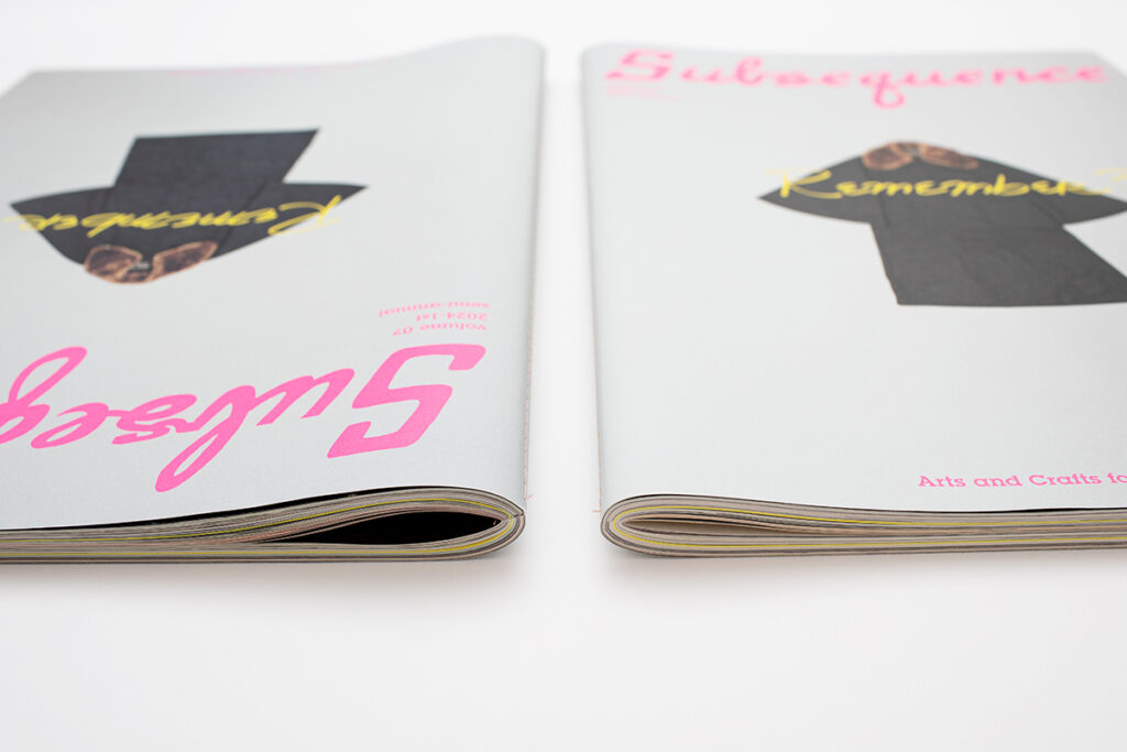
In the second photo, you can see how the overall feel of the magazine is different—with the softer touch on the left and the harsher quality on the right. It isn’t just the physical sensation nor the visual element that is different; the unique smell from the oil-based ink is gone from the UV ink proof.
Through this comparison, it’s reaffirmed to us that part of the charm of Subsequence is the texture and appearance of the oil-based ink, despite it not being the most “faithful” representation of the colors, and the smell that comes from opening the pages. The conclusion is that we will proceed with printing the magazine as ever with oil-based ink.
We’re not simply aiming for beauty and vibrancy. We want to choose the best method and take our time with our color adjustments so that we can best present and make use of the physical nature of the magazine, from its paper quality to its large size. This is merely one stage of the printing process, but we wish to continue to put in a lot of care into every step.
Subsequence vol. 7 will release on 9/7 (SAT). Prior to this, we are commencing pre-order sales on the official web store. We hope you will take advantage of this opportunity.
Almost All About
Almost All About Subsequence
vol.2: The Magazine Format
2022.10.21
Almost All About
Almost All About Subsequence
vol.1: Binding
2022.08.16
volume 08
2025-1st
Bilingual Japanese and English
260 × 372mm 148P
Release date: December 13, 2025